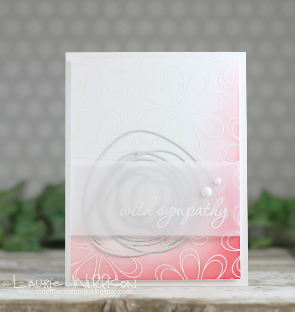
I have another card today for the latest PTI release. I used 2 new stamp sets and a fun new die all in one card. And I have a couple photos to share.
I used to "stage" my cards all the time and haven't for awhile. I have been seeing so many gorgeous photos out in blog land lately, so I thought I would dust off some of my "props". I have 2 different photos here. If you have time, leave a comment and tell me which one you like better.
So here is my card for today...

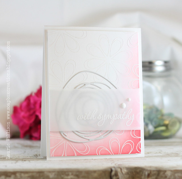
I heat embossed the flower from Oopsie Daisey with Filigree Embossing Powder and then used some Pure Poppy just on the edge of the card. I added in one of the new Circle Scribble dies and then layered it with a vellum sentiment. This sentiment is one from the new Keep it Simple: Sympathy Mini Stamp set.
I used to "stage" my cards all the time and haven't for awhile. I have been seeing so many gorgeous photos out in blog land lately, so I thought I would dust off some of my "props". I have 2 different photos here. If you have time, leave a comment and tell me which one you like better.
So here is my card for today...

I heat embossed the flower from Oopsie Daisey with Filigree Embossing Powder and then used some Pure Poppy just on the edge of the card. I added in one of the new Circle Scribble dies and then layered it with a vellum sentiment. This sentiment is one from the new Keep it Simple: Sympathy Mini Stamp set.
Here is the second photo....

I mostly use natural light but always struggle with what should go in the background. The floor of my photos is several slats of real barn wood. For some reason I can't change that. I love the look of barn wood.
Ok, enough babbling. I would love to hear what you think. Thanks for stopping in today! Hope your Sunday is relaxing!
Supply List:
the photos did not show up on my computer...there is a little box, I clicked on that and it comes up: PAGE NOT found.
ReplyDeleteBoth photos look awesome. I couldn't choose. I like the card, too.
ReplyDeleteI TOTALLY struggle with my pictures.
I have a light box, and a good camera, but I HATE taking pictures.
I don't use props, tho I know I should...
You do great work!!!
Thanks for sharing
Susan
Great photos but I'm more drawn to the second photo. Love the wood floor, a definite keeper.
ReplyDeleteGorgeous!!
ReplyDeleteoh Laurie! I love this SO much! The gradual pink color adds alot to it! :D
ReplyDeletecard is lovely! the first photo shows the card better because I can see the sentiment more clearly. the second photo, however, has a nicer to me background. I am not helping!
ReplyDeleteI once read (maybe on Moxie Fab World?) that there should not be anything to distract from the card and I agree with that. So I prefer the first photo... But that's just me. Love the barn wood and the card!
ReplyDeleteIt's tough because I love both pictures but I think the second just wins it for me. It has more natural light and just looks more inviting. Oh and keep that wood whatever you do!
ReplyDeleteI wish I could get myself organised with props but living a minimalist life leaves me with none LOL!
:)
less staging in my opinion- but yours is quite minimal and doesn't distract from the card. :) I wish I could get the natural light you get!
ReplyDeleteGorgeous card. Love the pink just on the edge. And always like embossing on vellum. Like the first photo with subtle ivy in back. The card pops more. I think the red flower in the bottom takes away from the card.
ReplyDeleteBoth are beautiful. Never lose the barn wood!!!
ReplyDeleteGorgeous card and I love both settings. However, if I had to choose about the staging, I prefer the first photo. The background does not distract from the card as much.
ReplyDeleteGreat card - I prefer the first photo with the focus on the card. The second photo is busy in the background, taking the focus off the card.
ReplyDeleteGreat card!! First photo you focus on the card more as the BG is more subdued. Like the lighting in the second better, extras in the b/g distract from the card a bit (in my opinion anyway...)
ReplyDeleteSo pretty! I'm really wanting those scribble dies. I have always loved your photos, I think the CAS backdrop really suits your style, but between the two photos I probably prefer the second. Not sure if it's because the flower really seems to bring out the pink or if I just like it better though.
ReplyDeleteYour cards are often gorgeously subtle, so all but the barest styling may draw attention away from them. I love the barnwood and the way it grounds your cards. You're on the right track with that. In my opinion, your work would be better served by natural wood, pale flowers, vintage bottles with great patina, or light greenery. I think the first photo works a little better in that regard, but it lacks the textural interest (differing heights and tones) of the second. In other words, somewhere between the two. I hope that helps!
ReplyDeleteYour cards are often gorgeously subtle, so all but the barest styling may draw attention away from them. I love the barnwood and the way it grounds your cards. You're on the right track with that. In my opinion, your work would be better served by natural wood, pale flowers, vintage bottles with great patina, or light greenery. I think the first photo works a little better in that regard, but it lacks the textural interest (differing heights and tones) of the second. In other words, somewhere between the two. I hope that helps!
ReplyDeletelovely card! Both photos are good but the top one highlights the card which is where the focus should be.
ReplyDeleteBeautiful card, Laurie! The first setting most definitely shows off the card better than the second setting.
ReplyDeleteI love them both!!!!! Put Puff in the background. ;)
ReplyDeleteYour card is so pretty, Laurie! The gradual blending is fantastic. I really love the mix of the bold color and lots of whitespace. :) In terms of the photo, I love how you typically have a minimal background. I think it sets off your card. With that said, I'm going to pin your second card because the card caught the light more. :)
ReplyDeleteLove this card, Laurie! It has such a soft, soothing feel to it. And your photos are beautiful. I especially love the real barn wood. For some reason I'm more drawn to the first photo. Hugs, my friend!
ReplyDeleteLaurie I think they both look amazing.. but the second one has more light. Either way your cards always look gorgeous and always well photographed.
ReplyDeleteGood choice on the real barn wood.. love the look
Great card Laurie! Your first photo shows of the card a little clearer I think but I love the 'staging' of your second shot!
ReplyDeletei love the barn wood.
ReplyDeleteand i think the first one is my favourite. it really helps the pink on the card pop a bit more without competing with the pink flower in the background.
one question for you... how do you blur your backgrounds? Do you use your camera on a manual setting? what lens do you use? i seem to always be saying "How do they do that!" i want to figure it out!
love the card too by the way. the blending is so lovely...
i always love your cards. so simple and striking. and perfect!
Stunning card, Laurie!!! I think I prefer the first photo. The flower in the second one takes away some of the attention from the card.
ReplyDeleteHave a lovely week! Greetings from SA!
Gorgeous card, I prefer the second photo I think, the background and angle I like.
ReplyDeleteFirst of all your card is beautiful! I like the second pic better. The light seems better and really shows off the detail.
ReplyDeleteUh - great colored backround!
ReplyDeleteYour photos are AWLAYS just as amazing as your cards. I'd vote for the 1st photo though.
ReplyDeleteBoth backgrounds are great, maybe depending on the card? Either way, I love the wood platform your cards sit on. Rustic and cool!
ReplyDeleteWhat a gorgeous card first of all and I think I like the first photo because you can see the sentiment better
ReplyDeleteWow, this is a very appealing card for me. Must try something similar in a card, SOON! Can't really say why but I am more attracted to the first photo.
ReplyDelete